How do you make a BBQ restaurant feel native to wine country without softening either side of it?
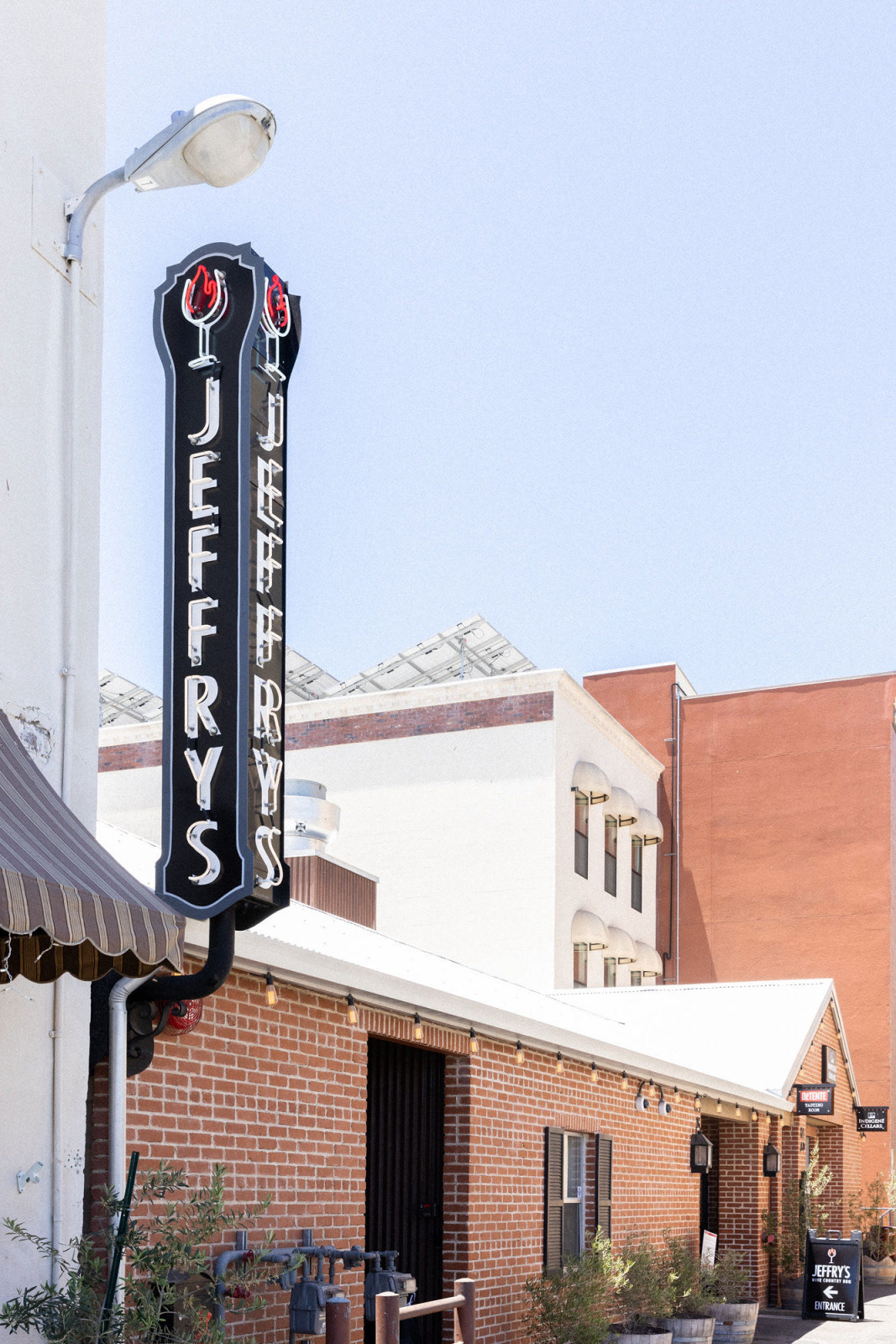
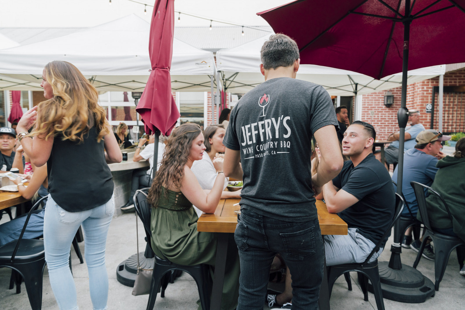
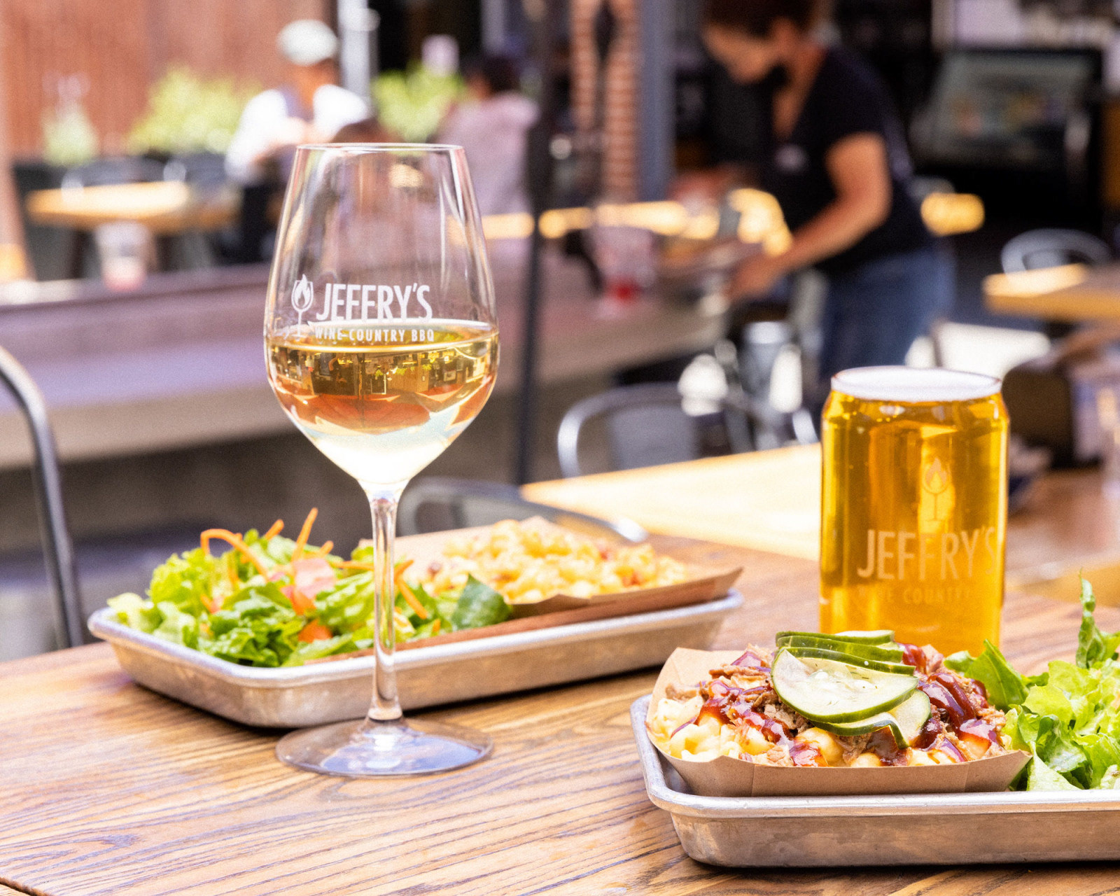
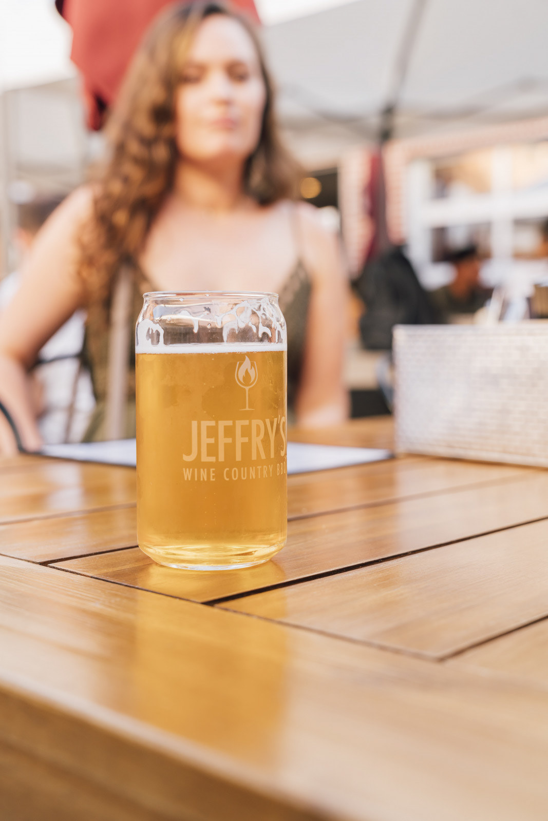
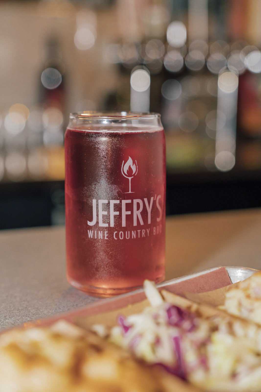
I designed every piece — concept, mark, wordmark, color, and the applications system. The icon fuses fire and wine into a single readable symbol; the wordmark sits in a confident all-caps display face that holds at any size, from a beer-can etching to a wall mural. The palette — deep burgundy, amber, and black — reads as both BBQ and wine country. The system stretched from etched glassware and branded beer cans to wall signage, staff apparel, packaging, umbrellas, and the patio environment.
The identity has been the restaurant's active brand since launch, running across the storefront, the bar, the patio, the merch, and every customer touchpoint. Built without an agency or a team — every asset shipped came from one designer. The flame-in-glass mark has become the visual shorthand customers and staff use for the place.